Building a Tailwind CSS Dropdown Menu
In this tutorial we'll build a simple dropdown menu using Tailwind CSS. We are taking a no Javascript approach inspired by DaisyUI so that it works in any project setup.
Prerequisites
Before starting, make sure you have Tailwind CSS set up in your project. If you need help, check out the Tailwind CSS installation guide.
Step 1: Create the trigger button
First, let's create a simple button. This is what users will click to open the dropdown menu.
<button>Dropdown</button>Optionally, to make it easier to see what we're building, add these styles to your CSS file to center everything on the page:
body {
  display: grid;
  place-items: center;
  min-height: 100vh;
}
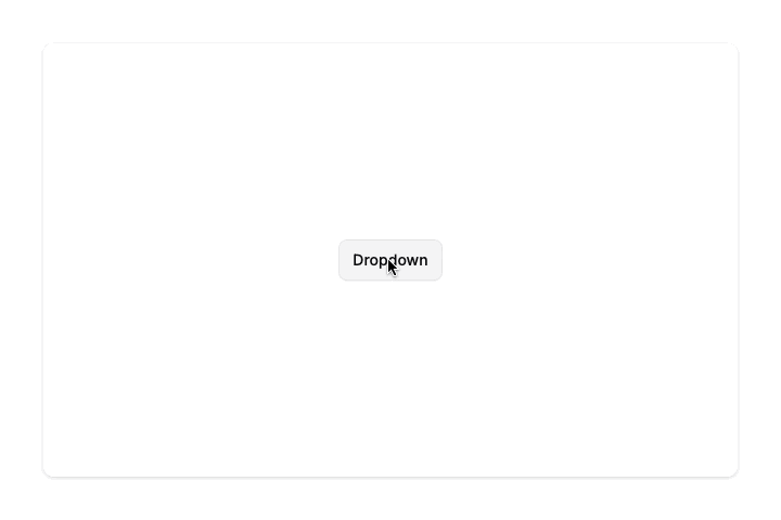
Step 2: Style the trigger button
Now let's make it look like a proper button with borders, padding, and hover effects.
<button
  class="
    rounded-md border border-gray-200 bg-white
    px-3 py-2 text-sm font-medium shadow-xs
    hover:bg-gray-100
  "
>
  Dropdown
</button>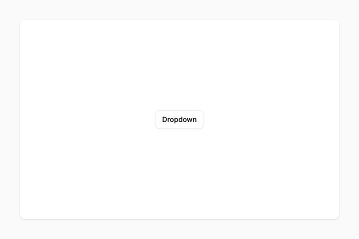
Step 3: Create the menu
Next, we'll add the actual menu with some links. We'll also wrap the menu and trigger in a relative container so we can position the menu relative to the trigger later.
<div class="relative">
  <button class="...">Dropdown</button>

  <div>
    <a>Item One</a>
    <a>Item Two</a>
    <a>Item Three</a>
  </div>
</div>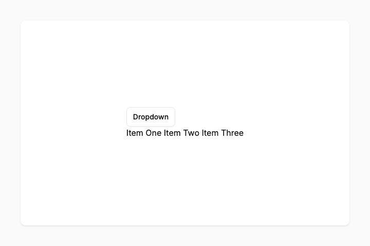
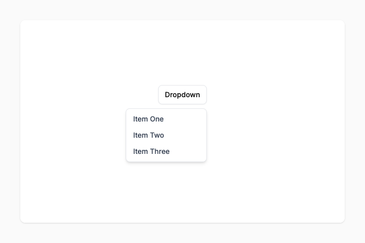
Step 4: Style and position the menu
Let's style the menu and position it below the button.
<div class="...">
  <button class="...">Dropdown</button>

  <div
    class="
      rounded-md border border-gray-200 bg-white p-1 shadow-md
      grid min-w-40
      absolute right-0 mt-2
    "
  >
    <a>Item One</a>
    <a>Item Two</a>
    <a>Item Three</a>
  </div>
</div>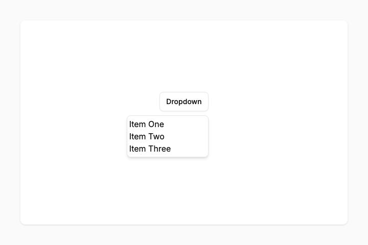
Step 5: Style the menu items
Let's also style the menu items.
<div class="...">
  <button class="...">Dropdown</button>

  <div class="...">
    <a
      class="
        rounded-md px-2.5 py-1.5
        text-sm font-medium text-gray-700
        hover:bg-gray-100
      "
    >
      Item One
    </a>
    <a class="...">Item Two</a>
    <a class="...">Item Three</a>
  </div>
</div>
All menu items use the same classes, I'll only show them once to keep it readable.
Step 6: Make it interactive
Now we'll hide the menu by default, and reveal it when the button is focused (clicked). We do this using Tailwind's group + focus-within, which lets any element inside the group change styles while any child element is focused.
<div class="... group">
  <button
    class="
      ...
      group-focus-within:pointer-events-none
    "
  >
    Dropdown
  </button>

  <div
    class="
      ...
      opacity-0 pointer-events-none transition-opacity
      group-focus-within:opacity-100 group-focus-within:pointer-events-auto
    "
  >
    <a class="...">Item One</a>
    <a class="...">Item Two</a>
    <a class="...">Item Three</a>
  </div>
</div>
Here's what's happening:
- group on the wrapper enables group-* variants on child elements
- opacity-0 makes the menu invisible
- pointer-events-none prevents clicking on invisible items
- transition-opacity adds a subtle fade animation
- group-focus-within:opacity-100 shows the menu when the button is clicked
- group-focus-within:pointer-events-auto makes the menu clickable when visible
- group-focus-within:pointer-events-none allows clicking the button again to close the menu
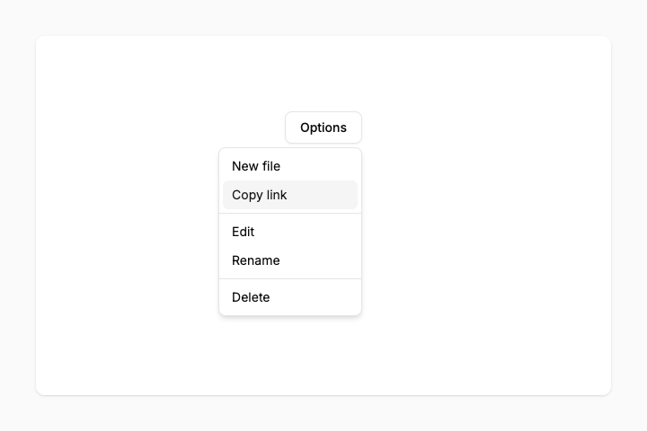
Complete code
Here's the full dropdown menu code you can copy and paste:
<div class="group relative">
  <button class="rounded-md border border-gray-200 bg-white px-3 py-2 text-sm font-medium shadow-xs hover:bg-gray-100 group-focus-within:pointer-events-none">Dropdown</button>

  <div class="rounded-md border border-gray-200 bg-white p-1 shadow-md grid min-w-40 absolute right-0 mt-2 opacity-0 pointer-events-none transition-opacity group-focus-within:opacity-100 group-focus-within:pointer-events-auto">
    <a class="rounded-md px-2.5 py-1.5 text-sm font-medium text-gray-700 hover:bg-gray-100">Item One</a>
    <a class="rounded-md px-2.5 py-1.5 text-sm font-medium text-gray-700 hover:bg-gray-100">Item Two</a>
    <a class="rounded-md px-2.5 py-1.5 text-sm font-medium text-gray-700 hover:bg-gray-100">Item Three</a>
  </div>
</div>
Using Starting Point UI
If you want to save time, Starting Point UI offers many pre-built components like dropdowns. It comes with more features like keyboard navigation, better accessibility, and positioning options.
<div class="dropdown">
  <button class="btn btn-outline" data-sp-toggle="dropdown">Dropdown</button>

  <div class="dropdown-menu">
    <a class="dropdown-item">Item One</a>
    <a class="dropdown-item">Item Two</a>
    <a class="dropdown-item">Item Three</a>
  </div>
</div>
See more dropdown examples here.