<div class="card">
<div class="card-content grid gap-6">
<div class="grid gap-2">
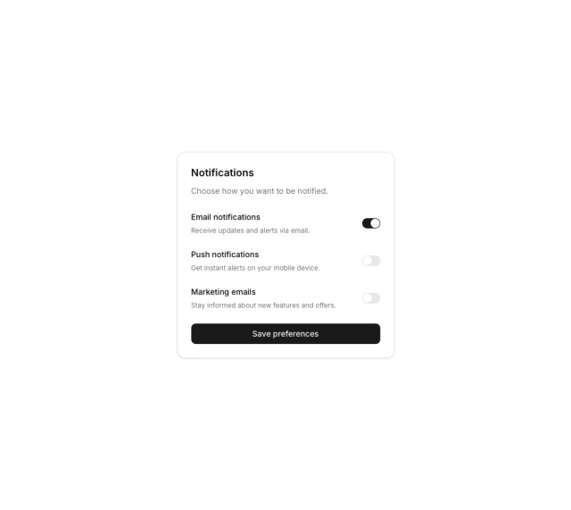
<h3 class="text-lg/6 font-semibold">Notifications</h3>
<p class="text-sm/6 text-muted-foreground">Choose how you want to be notified.</p>
</div>
<div class="grid gap-6">
<div class="flex items-center justify-between gap-4">
<div class="grid gap-1.5">
<span class="text-sm font-medium">Email notifications</span>
<span class="text-xs text-muted-foreground">Receive updates and alerts via email.</span>
</div>
<input class="switch" type="checkbox" role="switch" checked="" />
</div>
<div class="flex items-center justify-between gap-4">
<div class="grid gap-1.5">
<span class="text-sm font-medium">Push notifications</span>
<span class="text-xs text-muted-foreground">Get instant alerts on your mobile device.</span>
</div>
<input class="switch" type="checkbox" role="switch" />
</div>
<div class="flex items-center justify-between gap-4">
<div class="grid gap-1.5">
<span class="text-sm font-medium">Marketing emails</span>
<span class="text-xs text-muted-foreground">Stay informed about new features and offers.</span>
</div>
<input class="switch" type="checkbox" role="switch" />
</div>
</div>
<button class="btn">Save preferences</button>
</div>
</div>